Comme des Garçons Logo Evolution: How It’s Changed Over Time
The Birth of Comme des Garçons and Its Minimalist Identity
Comme des Garçons, founded by Rei Kawakubo in 1969, has always been synonymous with avant-garde fashion. Known for deconstructing traditional fashion norms, the brand introduced itself with an aesthetic that was as rebellious as it was sophisticated. The logo, much like the brand’s design philosophy, started with a minimalistic and straightforward approach. The earliest versions of the Comme des Garçons logo featured simple typography, often Comme Des Garcons in black, using a clean and modern sans-serif font. This decision aligned perfectly with Kawakubo’s vision of focusing on creativity rather than branding.
The 1980s: Establishing a Strong Visual Identity
During the 1980s, Comme des Garçons gained international recognition, and its branding evolved accordingly. While still maintaining a minimalist essence, the logo began appearing in different placements on garments, from subtle embroideries to bolder print applications. The brand name was often written in uppercase, emphasizing a sense of authority and presence. The consistent use of black and white in its branding helped solidify its strong, timeless identity, aligning with the monochromatic and textured aesthetics that defined the collections of this era.
The 1990s: The Rise of Playfulness and Sub-Brands
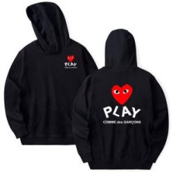
The 1990s marked a shift in Comme des Garçons’ branding, particularly with the introduction of various sub-labels. One of the most notable developments was the launch of Comme des Garçons Play in the late 1990s, which introduced the now-iconic heart logo with two eyes. This was a stark departure from the main line’s minimalistic approach, offering a more playful and approachable identity that resonated with a younger audience. While the primary Comme des Garçons logo remained unchanged, this period saw an expansion in how the brand experimented with typography and graphical elements.
The 2000s: The Popularization of the Play Logo
By the early 2000s, the Comme des Garçons Play logo had taken on a life of its own. Created in collaboration with Polish artist Filip Pagowski, the heart emblem became instantly recognizable and was embraced globally. Despite this playful divergence, the main Comme des Garçons logo remained untouched, reinforcing the brand’s commitment to its original vision. This contrast between the high-fashion mainline and the casual Play sub-brand highlighted the versatility of the Comme des Garçons identity.
The 2010s: Expanding the Brand’s Aesthetic Influence
Throughout the 2010s, Comme des Garçons continued its tradition of pushing creative boundaries. The logo itself remained mostly unchanged, but its usage became increasingly diverse. Collaborations with brands such as Nike, Converse, and Supreme saw the Comme des Garçons name presented in various typographic treatments. Some collaborations featured the logo fragmented, distorted, or abstracted, adding new dimensions to its visual representation. This decade proved that while the core branding remained intact, its application could be fluid and experimental.
The 2020s and Beyond: The Future of the Comme des Garçons Logo
As Comme des Garçons continues to thrive in the modern fashion landscape, its logo remains one of the most enduring aspects of its identity. The original typographic logo still serves as the backbone of the brand, yet the frequent collaborations and sub-labels allow for constant reinvention. Newer interpretations of the Comme des Garçons aesthetic embrace digital experimentation and abstract branding, ensuring the label remains as relevant as ever.
Conclusion
The evolution of the Comme des Garçons logo is a testament to Rei Kawakubo’s visionary approach to fashion and branding. While the core design has remained largely consistent, its adaptability through different Comme Des Garcons Hoodie mediums, collaborations, and sub-brands has ensured its lasting impact. Whether through the minimalist main logo or the whimsical Play heart, Comme des Garçons continues to redefine what fashion branding can be, proving that innovation and consistency can coexist in perfect harmony.